
Does your resume design matter? Does the visual look of your resume really make a difference?
The answer is a resounding YES.
We all know the saying that “you never get a second chance to make a first impression.” And although the numbers vary from milliseconds to 30 seconds, research backs this up. As a benchmark, it is fair to say the people we meet form an opinion of us within 7 to 15 seconds.
And guess what? According to some research, appearance alone is responsible for the vast majority of that first impression—as much as 70% or even more.
We all know that we shouldn’t “judge a book by its cover,” but like it or not, that is precisely what we all do. Appearance does matter!
So, consider this: your resume is the cover of the book that is you. It is your calling card. Most prospective employers and recruiters will see your resume before meeting you in person.
Your resume creates the first impression formed of you.
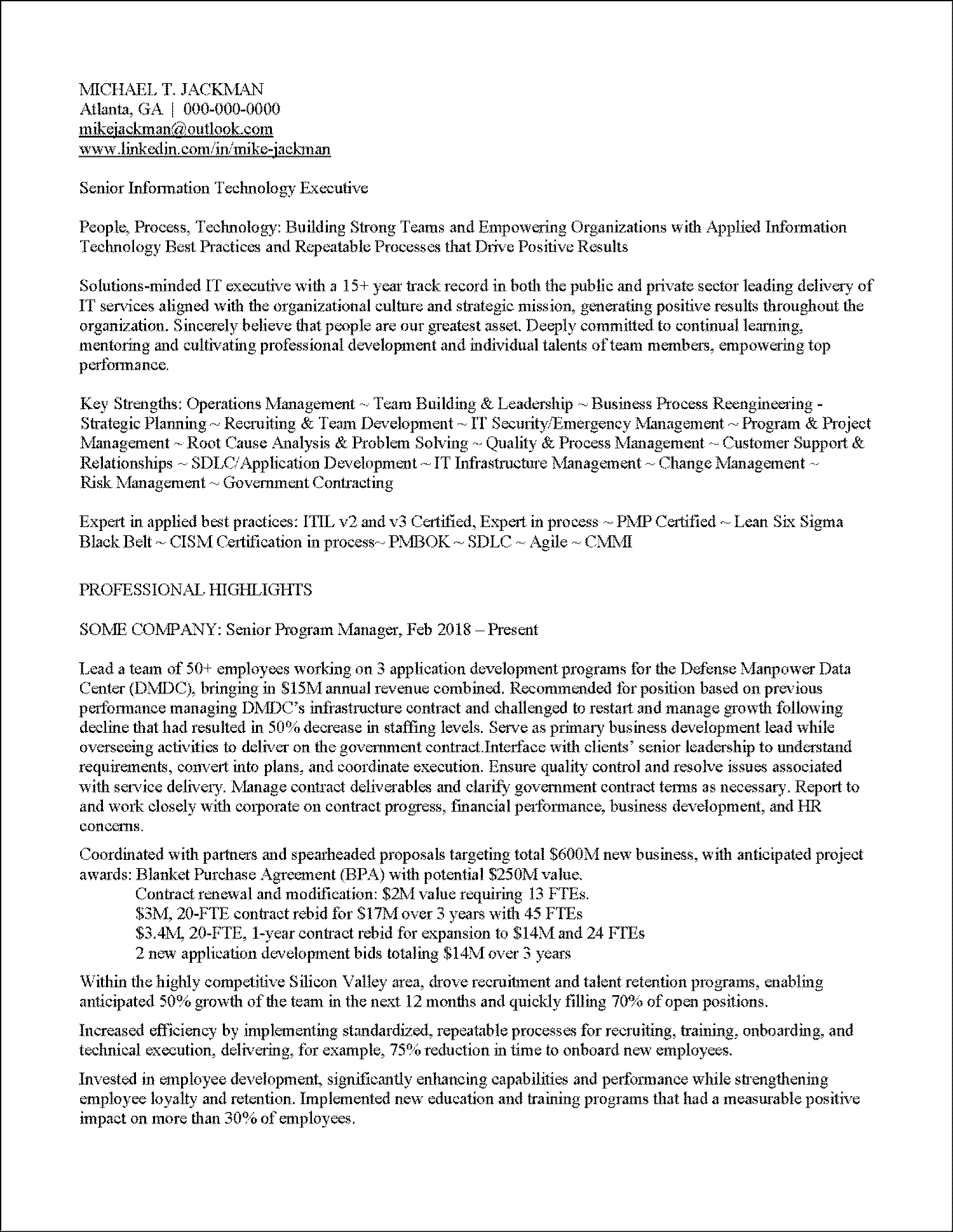
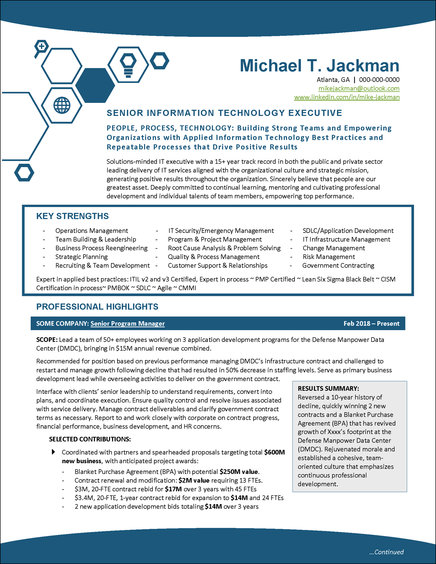
So let me ask you…which of these example resumes do you think will makes the better first impression on hiring managers? The content is exactly the same. The professional resume design is the only difference.
Yes, the words on your resume matter. They matter a great deal. Your resume needs to tell a compelling and memorable story of the value you offer your employers, and it needs to be filled with the keywords that are so important in applicant tracking systems.
But, before the recipient of your resume is drawn in by the words, you must capture their attention with the visual appeal of your resume design.
In these ways, an appealing, modern resume design is vitally important. The words on your resume won’t matter if the recipient never even gets to them because your resume design is so unappealing they just moved on to the next resume.
How To Improve Your Resume Design
The good news is that through attention to your resume design, you have control over the first impression that your modern resume makes.
The best option is to work with a resume-writing expert who is also an expert on professional resume design. But not only does the resume consultant need to be an expert in these two areas, they also need expertise on how the design of a creative resume interacts with applicant tracking systems (ATS).
Because if writing and designing a resume for a human reader wasn’t complicated enough, your resume design needs to “play well” with the electronic systems that recruiters and hiring managers use to track applicants through the hiring process. If it does not, potential employers may never even see your resume.
These are HUGE shoes to fill, and the unfortunate truth is that it is nearly impossible to find a resume writer who is also a professional designer and also an ATS expert.
Get Expert Help With Your Professional Resume
At Distinctive Career Services, our solution is to find and hire the best-trained, most highly accomplished professional resume writers and then supply them with hundreds of professionally designed, ATS-friendly, easily customized resume design templates.
This cutting-edge process allows us to deliver unfailing excellence to our clients, producing unique yet powerful, compelling, eye-catching, and ATS-friendly resumes.
Our resume writing team can focus on crafting the most powerful and persuasive prose to tell the career stories of our clients. Then they choose the best resume design to serve as the foundation for the resume.
In other words, they look for the best resume design template that offers the resume format and the resume layout that is the best fit for their vision for that client.
We have professional resume template options in all different styles. So whether they are looking for a traditional resume, a reverse chronological resume, a combination resume, or a functional resume to serve as a resume builder foundation, they have multiple options to choose from.
Then, they customize the design of that resume template, changing the colors and tailoring the resume sections to create a unique resume for each job seeker client that allows them to put their best foot forward with a resume that is guaranteed to get the hiring manager’s eye.

Is Using a Resume Template the Best Solution for a DIY Job Seeker?
As a job seeker, if you have updated resume content that you are happy with, using a resume template to modernize your resume design is an option. The best resume design templates will allow you to just copy and paste your resume content into the right spots. It can be a fast and easy way to give your resume a facelift before you apply for your dream job.
Unfortunately, most resume templates are inflexible and impossible to customize, and many aren’t even ATS-friendly (so buyer beware!). A poorly designed resume can do your job search more harm than good.
So make sure you are getting your resume template from a reputable and expert source. If you DO decide to go the DIY route and use a resume template to enhance your resume design, you can feel completely confident using any of the Distinctive Resume Templates.
Here are a few inspiring resume design template examples:

Example Resume Template for Engineering Professionals

Example Resume Template for Film & Entertainment Industry

Example Resume Template for Preschool Teachers & Childcare Providers

Example Resume Template for Nurses & Healthcare Providers

Resume Template for International Business Leaders

Example Modern Resume Template for Executives
More Resume Design Tips
While striving for eye appeal to make your resume pop and improve its first impression is enough reason to put extra time and attention into your resume design, there are other reasons to focus on design as well.
As marketing pros know, color and page design improve marketing results. Consider these statistics from marketing research:
Remember: your resume is a self-marketing document, and all these statistics apply to your resume as much as they apply to a marketing flyer. Here are some ways you can use this research to enhance your own resume.
Using Color on Your Resume
If your resume’s appearance is dull and you are looking to fix your resume‘s eye appeal, using color is the often first and easiest change to improve visual interest. But just because applying color to your resume is easy doesn’t mean you don’t need to consider it carefully.
Colors have meanings, and your color choices have consequences.
You can use color to make your resume stand out and help convey and reinforce the right brand image. However, if you do so randomly without any strategic thought, it might have the opposite effect, giving the hiring manager a negative impression.
Color has powerful effects on our perception. On resumes, it can impact the first impression the document makes before the recipient even reads about you.
Select colors that reflect who you are and that will help tell the story of your career.
Red, for example, might not be the best choice for an accountant. Green would be perfect, though. Pink or other pastels might be the ideal choice for a preschool teacher but a terrible choice for a software engineer. Let your job history, job search objectives, and personality guide you.

A few popular color choices that you might consider for your resume design include:
And finally, don’t forget about blacks and grays, as these often look striking when paired with other brighter colors. Gray is a conservative color often associated with intelligence, formalities, business, conventionality, and maturity. Black is often associated with power, elegance, and sophistication.
Also, remember that color can emphasize or de-emphasize areas of your resume. For example, you might use a light color for the background with darker shades for the text and headings to make them stand out more.
Or you might use a dark color for the background with lighter shades for the text and headings to make a more sophisticated or sleek resume design.
Just be careful not to go overboard. Too much color can be just as bad as too little. The key is to use color in a tasteful, appropriate, and strategic way.
Some resume designs that use color very well include:

Resume Design & Color Example 1
Shades of purple, green, and blue work well in this resume design for an executive coach

Resume Design & Color Example 2
Dark blue is striking color choice for the design of this executive board resume

Resume Design & Color Example 3
Oranges and reds aren't right for everyone, but they are perfect for this solar industry resume

Resume Design & Color Example 4
Dark jewel tones of purple, green, blue, and red make this resume for a technology consultant stand out

Resume Design & Color Example 5
Dark browns and golds are an excellent resume design choice for this international business executive

Resume Design & Color Example 6
Blues and reds are an eye-catching power choice for this executive resume design
Incorporating Charts and Graphs into Your Resume Design
Numbers can be dry and boring to read, but if you want your professional results highlighted, consider presenting them graphically. There’s no better way of showing that there has been an improvement than through a chart or graphs!
You might have heard the term “infographic resume.” While these visually interesting one-page documents have become quite popular as a complement to longer, more detailed traditional resumes, an infographic resume doesn’t replace the need for a traditional resume. But you can dramatically improve the visual interest of your professional resume design by incorporating a select few infographic elements.
With Microsoft Word’s powerful tools for creating these images in just seconds flat, it will take less time than ever to get creative with how you present your accomplishments.
Here are some examples from resumes we have written for our clients:


Using SmartArt & Other Design Tools in Your Creative Resume Design
Using the Shapes and SmartArt features in Microsoft Word is another easy way to create all sorts of graphical elements to serve as visual representation of your qualifications.
The defaults offered in Word are highly customizable to showcase whatever information you want to showcase.
Here are some examples from resumes we have written for our clients:

Callout boxes are another way to draw attention to crucial information. Microsoft Word’s Text Box feature can be used for this or depending on the layout, you can use a single-cell table. This is a great technique to showcase signature accomplishments, a personal branding statement, or even a quote from a reference letter. Some examples:

Do be aware that when your resume is “fed” into an applicant tracking system (ATS), any text that you’ve entered into these graphics will be unreadable and won’t benefit you in keyword searches.
Most modern ATS will ignore the graphics. This is a positive because it allows you great creativity with your resume design. Just make sure you repeat any important keywords in the graphics within the resume’s body.
Make Sure Your Resume is Easy for the Hiring Manager to Read
White space is the negative space around text and design elements. It helps organize the content of your resume, helps direct the reader, and helps focus attention.
While it might seem obvious, many job seekers skip this design consideration.
Here are some tips for using white space effectively in your resume.
Fonts Are Important Too
Use fonts that are easy to read and common on most computer systems. If you use an uncommon font, and the person on the receiving end doesn’t have the font, when they open your resume their computer will often make a substitution–sometimes with a devastating effect on your resume design and layout.
Calibri, Tahoma, and Verdana are all excellent sans serif fonts. If you’d prefer serif fonts, try Cambria or Georgia.
Don’t get too creative here. As already mentioned, the wrong font can cause serious problems.
Using more than two fonts in your resume isn’t recommended either.
You may use one font for both text and headings (increase the font size for the headings). Or, try a serif font for headings and a sans serif font for the body text.
Final Considerations
Finally, remember that too much of a good thing can be bad. Inappropriately or excessively applied design can make your resume look gaudy or flashy. This is not the first impression you want to make. Think strategically and have a reason for your design choices.
And, before you submit your job application, remember that submitting a cover letter written to show the hiring manager exactly how you have the relevant skills and are the best candidate for the job description is always smart.
As you craft your cover letter, to make a really professional first impression on the hiring manager, match the design to your resume. All of the resume design templates in the Distinctive Resume Templates portfolio include a matching letterhead to be used for cover letters and other job search correspondence.
After reading this article, if you still need ideas for cool resume designs, you can find even more inspiration for modern resume designs in our resume examples portfolio.
And, if you are feeling overwhelmed, as stated at the beginning of this article, working with a professional resume writer is always an excellent investment. You do not need to go it alone! Reach out to learn more about how we can help you and receive a free quote.
")


